
Move over flat design, there’s a new design trend kid in town: the whimsical custom illustration!
SaaS (Software-as-a-Service) companies have run with this trend recently, to the point where it’s now hard to find a software landing page that doesn’t contain an large illustration above-the-fold.
Over the last few months, I have been stumbling on more and more of these landing pages that somehow all look unique and also kind of the same.
We’ve come a long way from just showing screenshots of the software interface on the homepage!
Here are 8 SaaS landing pages that use quirky illustrations to convey their products.
1. Basecamp

Basecamp was one of the first companies to kick off the illustration design trend. Archive.org first records a landing page with this illustration being rolled out some time around November 2016.
The “woman with her hair on fire” illustration is a very powerful visual metaphor for the problem that Basecamp’s software can solve (too many work messages).
As of September 2019, Basecamp is ditching the illustrations in favor of a new look homepage (read more about that below):

2. OptinMonster

OptinMonster is marketing lead generation software. Their homepage illustration is very similar in style to Basecamp’s, but they’ve taken the creative decision to show the ‘before’ and ‘after’ of the product instead.
3. Slack

Slack’s custom illustration is a lot plainer than Basecamp’s and OptinMonster’s. Instead of using a frantic character, they’ve gone for 3 calm and productive figures (of different sexes and colors) interacting with slack (a team messaging service).
It’s a less eye-grabbing image, but quickly conveys the collaborative and inclusive nature of the product.
4. Intercom

It’s interesting how some SaaS companies highlight the “problem” their product solves, while others emphasize the “solution” angle. Intercom is the latter.
5. Airtable

Airtable’s illustration artfully depicts diversity among its user base with the colors pink, yellow and blue and represents a variety of sexes while it’s at it.
Airtable is yet another team planning/messaging SaaS company, so it’s no surprise that they’ve chosen to showcase their product on the homepage in a similar manner as Basecamp and Slack.
6. Jira

You’ve got colorful people (check!), mixed sexes (check!) and a lot of interaction with the product. I think Jira’s illustration runs the risk of being quite boring and not distinct enough to set it apart from the competition.
7. Trello

Another of Atlassian’s products, Trello’s original graphic is not a world away from Jira’s hero illustration – a mixed group of people interacting with a stylized product interface.
Trello does manage to convey more personality with its illustration; there’s even a dog (!) to let you know that you really can organize anything with anyone. If anyone has managed to get their dog to use Trello, please let me know and send pictures.
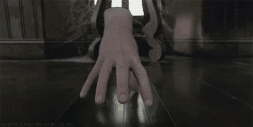
8. Hootsuite

Hootsuite is social media management/scheduling software.
For some reason, the company chose to create an illustration of a cat and a dismembered hand (complete with watch and tree rings? It gets weirder the more you look at it…) interacting with a cartoon version of Hootsuite’s interface.
An interesting choice.
Nonetheless, it mirrors the trend of using an illustrated version of the product instead of a screenshot, and conveying interaction with characters.
Is the cat interacting or just watching the hand? I think it might want to pounce on it…
Why I think these illustrations were effective (in 2018)
Whatever your personal design preferences are, it’s clear that the SaaS world has been heavily influenced by illustration in 2018.
I don’t know how long this trend will last, and what might replace it, but I do think that the whimsical and sometimes intricate designs go a long way towards humanizing software products and conveying a user-centric approach (with perhaps the exception of Hootsuite’s weird hand, which is conjuring up a lot of images of Thing from The Addams Family).
At the end of the day, it’s people who use your website, people that buy your products online and people who will help you succeed in online business.
So it’s not too crazy of an idea to have some images of them on your website. Even if they are cartoons.
Do custom illustrations still work in 2021?
Now it’s 2021, it’s clear that most recognizable SaaS companies are still holding on to the custom illustration trend.
And we’re not the only ones who noticed how all SaaS companies look the same these days:

If you pay attention to Basecamp, who I believe were at the forefront of the illustration bandwagon, you’ll notice a whole new design trend for 2021:
Note the stark contrast to the old style: bold typography, mostly white color scheme with single-color accent (yellow), and annotated product screenshots. I am a big fan of the handwriting style, which adds the personal touch that feels more human than other fonts. I believe it was the hand-drawn look of the illustrations that proved so popular: software companies are all about tech, so it’s the human element that they need to shine through in their branding.
I predict that we’ll see a reduction in custom illustrations going forward, and more of the clean, bold, hand-annotated look that Basecamp are pioneering.
Let’s see how it evolves.