Disclaimer: I’m not in any way affiliated with any political campaigns in the US (or UK for that matter). I am neither commending nor criticising either candidate, simply commentating on the website and branding practices at play.
As a marketer, I love picking apart other people’s campaigns, but when the stakes are as high as determining the next leader of the United States, it’s even more fun.
While looking at the websites for the ‘big 3’ presidential candidates – Hillary Clinton, Bernie Sanders and Donald Trump – I noticed several ways in which Hillary’s site left room for improvement.
On the surface, HillaryClinton.com seems like a stylish, smart website that’s visually appealing and informative, but a deeper look revealed more than one major flaw…
Too Many USPs
Unique selling propositions, those things that make your product or service, or candidacy, unlike any other. Usually, with ecommerce sites I see a lot of “Free Delivery and Returns” or “Rated 90%” claims, but when it comes to an election, USPs are policies.
Let’s ignore Trump’s very dated website theme (perhaps it’s intentional), there’s one thing his campaign site gets right and that’s narrow down his USPs, or as he calls them “Positions“.
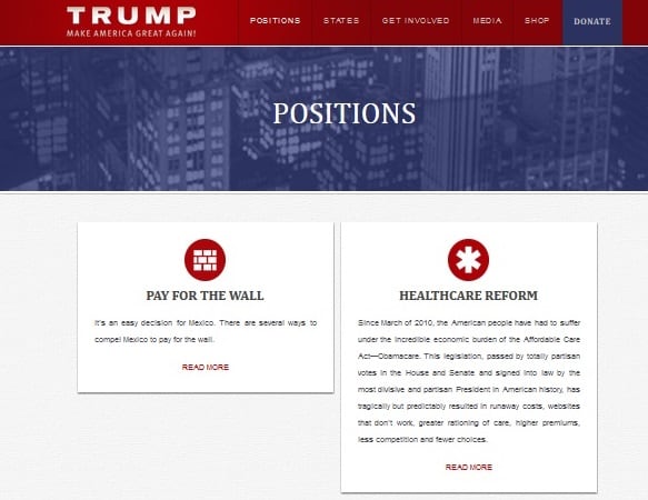
Along with some icons straight outta 1995, Trump lays down his 7 key positions and it’s quite clear from a quick skim read what these are.
Another key benefit of keeping to these 7 points is that people quickly become aware of these ‘brand principles‘. Trump is regularly making the news by, purposefully, being controversial in the way he frames his positions. Ask anyone in the world what Trump stands for and you’ll hear plenty of people hit one or more of his 7 USPs. That’s good marketing.
It is also important to point out that the Trump brand successfully merges online and offline marketing in this way, by having a narrow focus on key USPs.
Let’s look at Hillary’s USPs, or as she terms them, “Issues“:
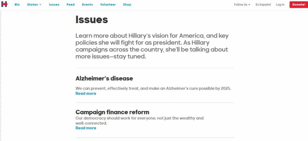
Already I can note a huge different between the use of the word “Position” versus “Issue”. A position is a stance, a bold statement, making a stand, whereas an issue is a subject or problem, a passive thing that needs solving. It linguistically suggests that Hillary wants to work WITH people to solve issues, whereas Trump is stating that he can take a position to solve issues himself.
I scroll through Hillary’s “Issues” page and find 31, yes 31!, different issues, arranging in an unremarkable alphabetical order. You don’t have to be a CRO expert to know that alphabetical order is almost always the wrong way to order your USPs or products.
There is no hierarchy of information, nothing to tell the reader which issues are key. Issues range from curing Alzheimer’s disease to early childhood education. I’m not saying these issues are in any way unimportant or should be left out, but in order to optimise the website, users need to see more structure so they can click on an area of interest that appeals to them. I suggest grouping issues by type: health, education, taxes etc and then having sub-sections for people to read through.
In the battle of the USPs, Trump wins hands down. (For further reading, I recommend Scott Adams’ piece about Trump’s policy details.)
Weird Opt In Form Text
When Hillary’s website was used for her campaign for senate back in 2005, her homepage featured a modest little opt in form and users were treated to getting “access to all of our online tools” as a reward. Whatever they were (hope it wasn’t an email account…).
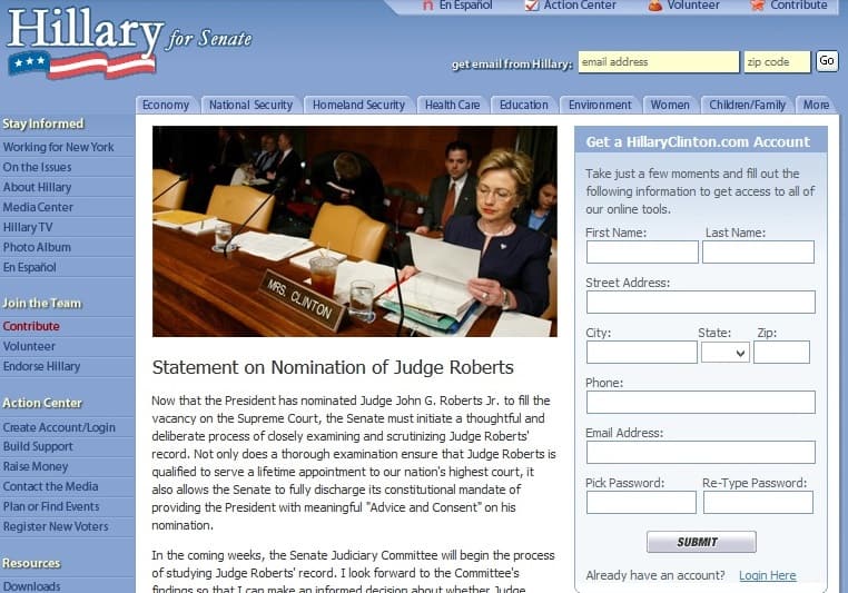
Flash forward to 2016 and Hillary’s opt in team are hitting it hard. Using Optimizely, they have been A/B testing opt in form text, from simply “Join the Clinton Campaign” to the all-guns-blazing “We can’t risk a Donald Trump presidency”.
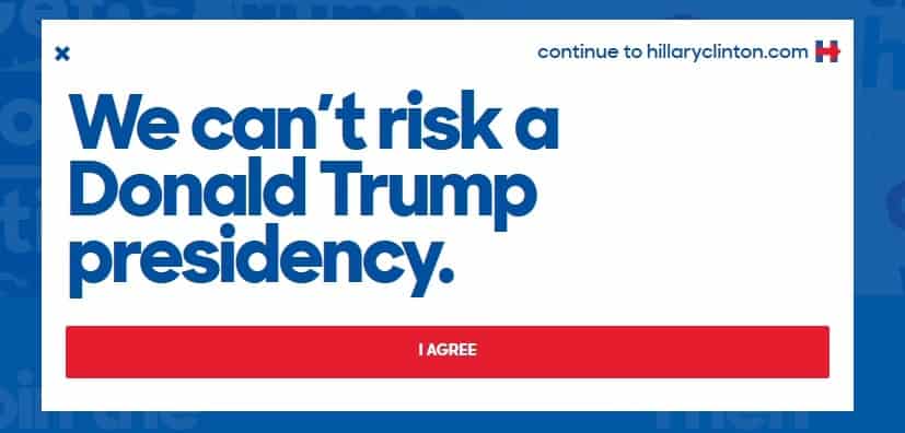
Now hold on a minute, this smells of the old comparative advertising trick. You know the one, like that time DHL shipped a bunch of boxes by UPS, TNT and DPD stating that “DHL is faster”.
You will have also seen Pepsi going after Coca-Cola, and Burger King taking on McDonalds in the same way.
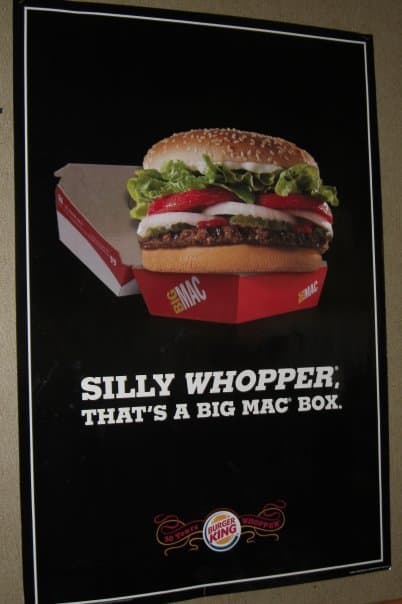
More often than not, the brands choosing comparative marketing are the underdogs, aka less popular than the brands they reference. In addition, they also use humour as the primary tool. This is why it surprised me to find Hillary’s opt in form text so strikingly, unhumorously anti-Trump.
Her “Love Trumps Hate” slogan is much smarter and has the required humourous element to make it an acceptable strategy, but by calling Trump out as a “risk” it not only gives him added power and authority, it does not remind audiences of why Hillary is a ‘better’ choice, or what her USPs are. Another bad CRO choice in my opinion.
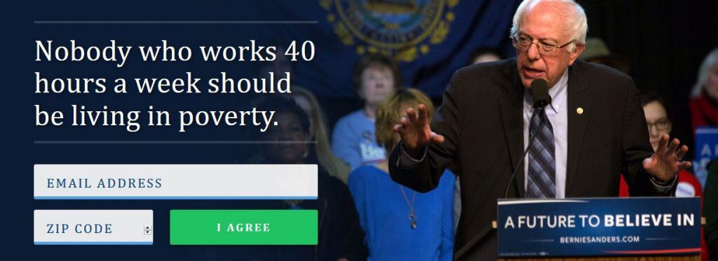
Looking at BernieSanders.com as another opt in form example, the differences are striking, as his opt in text makes his USP crystal clear.
BuzzFeed-style Clickbait
We all got fed up with clickbait about 2 years ago (although people keep on clicking..) and it’s one thing to begrudge BuzzFeed a click or two, but when the same style of ‘journalism’ is on a political candidate’s website, it is mightily odd.
Clickbait articles seem more like the kind of red-rag-to-a-bull kind of tactics that normally come out of the Trump camp (We asked Mexicans to build a wall, you won’t believe how much they paid for it!), so imagine my surprise when I saw Hillary’s news feed:
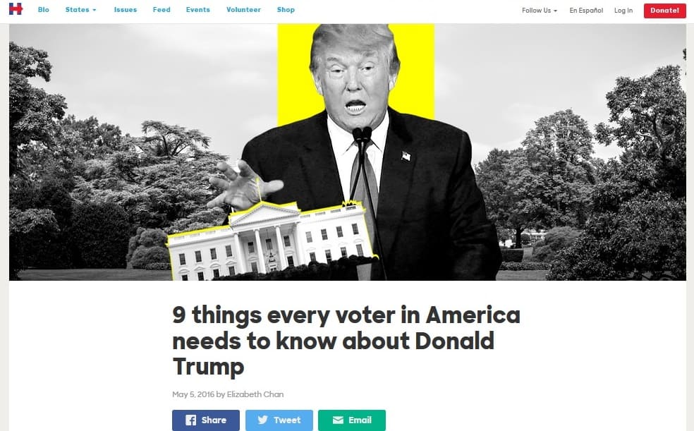
Again, it’s a major branding disconnect – on the same website we have a very dry and frank list of issues, and over in the news sections a clickbait smear campaign.
I understand that political candidates have different target demographics, but it is down to the skill of the branding strategists to come up with a website structure and style guide that works as a whole.
Maybe the Hillary campaign team can take a look at Usability.gov’s advice on using personas and user research to build better website experiences.
After all, the presidency could depend on it.
